Friday 30 December 2011

Its nearly there!

After days of endless slogging to get something looking as good as I can I have the basic storyboard for how I want the site to look, feel and navigate.


Text Considerations


As the site is intended to help new (and disillusioned old) Christians it was going to be very text heavy with a lot to read with lots of links. I spent some time researching how much text should be on a page and with Nielsons evidence to back up my findings I have reduced the amount on screen and opted for linking out to PDFs. This will allow people to download the site content and read on e-readers later or on iPad.


No Flash or Flashiness!


The site may seem not very exciting but the type of audience I will have for this site will be seekers of written information rather than glossy interactive flashiness (plus my graphic design skills are poor and need development).


On the subject of Flash I want the site to be easily readable on Apple devices as some people who have already expressed an interest in the site use them so I have no intention of included any Flash on the site.


Here is a sneek preview of the Home page.


Why so sandy coloured?

The colouring is meant to represent the dustiness of the Holy Land. the inspiration came from a rock brought back from the site of where Jesus would have walked in Jerusalem by a dear friend (see picture below)


The contrasting black text is one I arrived at after experimenting with White (madness) and various shades of grey. I also spent a lot of time looking at images of ancient Hebrew and Aramaic scrolls and the colouring of the site is visually evocative of the how the information contained on the site was originally presented to the ancient reader.

To Social Media or Not

A lot of social media is a bit of an anathema to me and I don't want younger members of the target audience being exposed to inappropriate messages which led me to agonise over having a Facebook page. In the end I put on a link to a Twitter account with a strap line of "Follow me following Him!" this would raise a smile among the audience.

So I wasn't fully Web 1.0 I also decided to have a Blog. This would be hopefully bring traffic back to the site and allow people to follow me using their reader application like Google Reader or RSS.

The content on the site won't be the usual lines of a Christian site where lots of e-commerce happens as I wanted to "give freely as I have received" the amount of free information and tools would also drive traffic back to the site.

Lack of Images

I have purposely left out photos and illustrations from the site unless they would provide further illustration to support the text. A lot of Christian websites are very image busy and according to Cognitive Neuroscientist Dr Itiel Dror unnecessary imagery impacts negatively the cognitive process of learning.

The website is aimed at providing learning materials for new Christians and unnecessary images I believe would impede their learning.


There are also considerations around the use of images and idolatry and also what the audience would interpret by certain images. For example if I uploaded an image of the Devil most people would immediately think half man, half goat, red with horns! That isn't how is is represented in scripture so I would promote unscriptural images of what Christians believe as the Enemy. In truth the devil is (we believe) Angelic in form and is named in Genesis as Nakhash which can mean Serpent (where you get the snake reference) or Shining beautiful one!


Anyways didn't mean for this post to turn into a Bible study I just wanted to explain that imagery and the semiotics associated with the Bible are very difficult to understand without the right tools. Hence the need for the website.


Signing off for now!

See you next time.


Thursday 29 December 2011

Which font?

Looked at a lot of fonts for style and how good they look to the reader. We have always used Arial 10 at work and I really like the visuals of it. I needed some usability evidence to prove it (as my site will be text heavy).

I came across this golden nugget of research concluding that Arial is indeed better than Times New Roman.

http://www.surl.org/usabilitynews/22/font.asp

I can conclude I will be using Arial 12 as the font for my site!

Friday 16 December 2011

Usability Testing

On Thursday I had the fantastic opportunity to facilitate a set of usability tests on a new learning portal. The day was very fruitful for the organisation as it threw up many different issues we hadn't considered or had but didn't have any evidence to back up our claims.


Methodology


The testing would use eye tracking software to record the users (learners) interaction however the reporting side does not work with flash and this reduced our reliance on this slightly as we had a list of questions we had prepared before hand to facilitate the session.


What were we testing?


The learning portal was a website full of resources designed for learners who after completing it would have received a detailed introduction to a particular employment sector.


Target Audience


The target audience of the portal is predominantly going to be 16 - 24 NEETs who are trying to get a job.With this in mind the portal was designed very closely with the look of  social media websites. I think this affordance made it easier to understand for them but some of the images weren't clicked on on the home page as they thought they were banners not links to resources.


Information Structure


One of the important things to note about this portal is that it is unlike other learning that the organisation has commissioned to be designed in the past. Usually the courses are traditional linear e-learning materials with the portal the non linear approach has been taken deliberately to encourage learners to dip in and out of it. it encourages them that there isn't a single pathway through it.


I wanted to draw this out of the tester to see if they wanted to follow a particular direction and luckily they all didn't. I say luckily because the all understood the structure and could find there way around.


Use of imagery


The images used in the portal were primarily for decoration and they were relevant to the topic, the iconography on the other hand was bespoke and some of the testers didn't understand the correlation between the iconography and the navigation (to be fair I didn't get some of it).


Use of language


The language of the site was aimed at Level 1 learners but how the words were used to describe sections of topic headings was identified by the testers as being unclear. For example My Journey is an introduction and the testers thought it was a learning log, but there was already another button for learning log.


What did I learn from it for the course?


For me the day was really helpful in understanding the importance of usability, really simple things like an x button to close something down was found to be not intuitive and grey text on a white background meant that 8 out of 9 testers missed the visual aid explaining whether they had accessed a particular resource or not.


We didn't spend too much time on use of colour etc. as the site would be re branded, as this is an area where my skills aren't good I would have liked more.


All in all a fantastic learning experience and one I will look forward to repeating!


Friday 9 December 2011

User Analysis - Learners using a community

In this blog posting I want to record my response to the activity in the coursework. We were tasked with building a group of model users. In my example I want to explore the users who use a particular online learning community.


The background to these learners is that they do not possess basic skills qualifications in either maths, English or both. They are very varied in age range but a significant percentage is female.


The have a need to obtain a qualification for many motivations including improving employability, seeking to further or restart their learning journey that may have not have been completed in school.


The learners are socially adept as they have engaged with a registration based web community with relative ease. They also have basic IT skills as they have decided to learn completely remotely without face to face support.


Serendipity?


This week I am leading a User Experience session to test the usability of one of our new online courses. This user analysis will be useful. The user experience trial is taking place with a company called Bunnyfoot who will provide me with a suite and eye tracking software.


I will blog about the results next week

Basic Interaction and Navigation Structures

In this posting I want to relate what I learned in this section of the course.


The term Basic Interaction did put me off slightly as I went in with the "I only need to give this a cursory glance as I know it" attitude which is plaguing me this module.


On reflection the key piece of learning in this section was the Navigation Structures section. As previously stated I am a Learning Designer and I spend quite a bit of time explaining that e-learning doesn't necessarily have to be linear. The section allowed me to understand clearly when structures need to be defined in particular circumstances to allow better information design.


I tried out this theory on some e-learning I was designing and tried so hard to not make it linear. In the end I gave up. The e-learning in question was a software simulation demonstrating how users use the learndirect systems to manage the learner journey. In the end chronological journey meant linear structure. I looked into branching scenarios off but time got the better of me.


When I begin to design the site I think I will mock up in powerpoint like I do for my storyboarding techniques and then arrange on a whiteboard to work out the best structure and relationship between the pages.


Video Resource


In my research to help me with this module I have found a great channel on YouTube!


Here is an example:


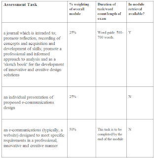
Overview of Assessment

I have restarted this module very late. I will use this posting to confirm what assessment is to take place and an overview of my plans.


I am really excited about this module because my job role is that of a Learning Designer. Learning Design is obviously very close to Web Design in many ways and the underlying theory and practice are things that i come across every day.


The challenge for me in this module will be separating the what I think I know from the what I should know. A lot of the principles and concepts are as I have said very similar. Unfortunately I have not had formal training in instructional design so my experiences have been very hands on designing what works practically and what doesn't.


The whole theory of web design is something that surrounds me on a daily basis but after reading a lot of the course materials I can identify that it is a mixed bag of whether it actually is effective of not.


So what do I have to do to validate the learning?


The table below extracted from the course materials describes the outputs:


Journal

For the journal I intend to maintain this blog and then extract the most effective elements to produce the final document. My strategy will be to write as much as I need to then edit down to the required 500 words.

An Individual  presentation of e-communications design

This in principle should be straightforward as part of my role is to design storyboards for elearning. However recently I have been called upon to design an online Individual Learning Plan to replace the paper one that is currently being used by government funded learndirect learners. This design is very detailed with many screens and I was originally going to use this for the project but had to rethink and restart as:

a) I wouldn't be able to develop the website myself (our development teams would do this)
b) I would be restricted by the current style and functionality of our Learning Management System
c) The interworking required between the screens requires high levels of validation to support funding and audit requirements which my skills could not hope to be able to achieve
d) The design has become so successful the organisation is willing to invest significant expenditure to get it ready before august 1st and the current resource plan would require a team of 20 to develop and implement.

I now have to rethink my approach for the design. Reading through the courseware has highlighted lots of deficiencies in my approach to the above design anyway so a fresh start is going to be easier.

An e-communications designed to meet a specific requirement

This will be very interesting and I have a website account with Weebly.com so I think I will produce the site there. I think the topic will be around the web and learning.